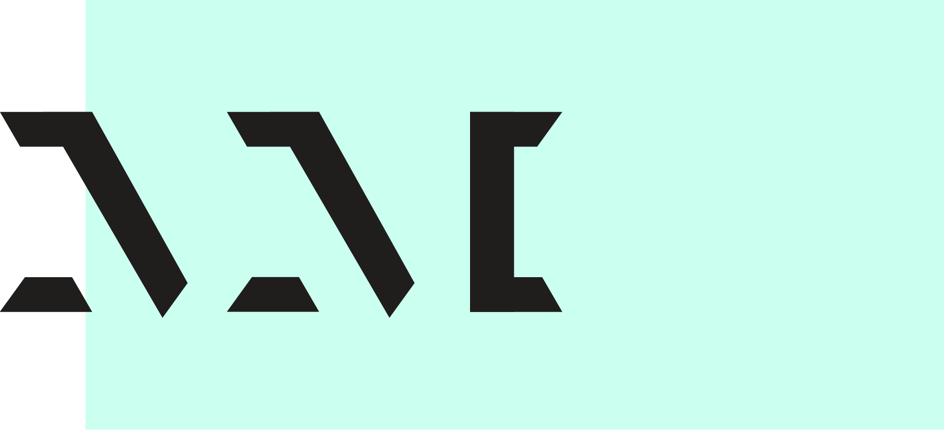

Here's the old logo:
There are a number of design issues we needed to address. The logo is too horizontal for many situations and fails to distinguish the company from its products. The mark contains an awkward empty space and is not very legible because it doesn't follow the "L" letterform. Avenir Next, while a respectable typeface, falls short in capturing the technical nature of the company. People also generally refer to it simply as "Lucid," while the logo overly emphasizes the legal name. Perhaps most importantly, the old logo does not contain any valuable or memorable meaning apart from the name of the company.
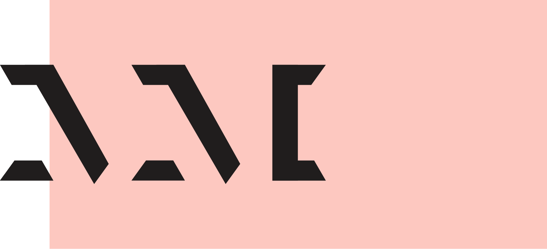
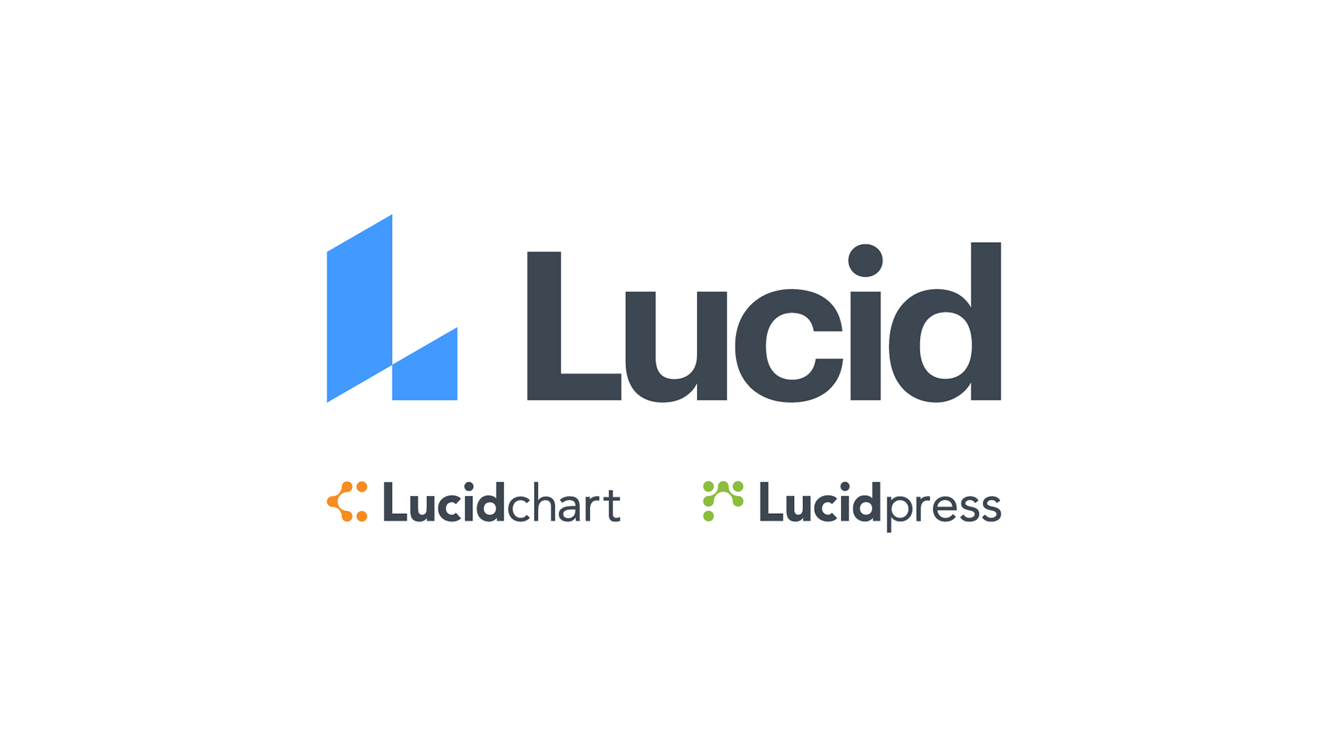
The new logo:

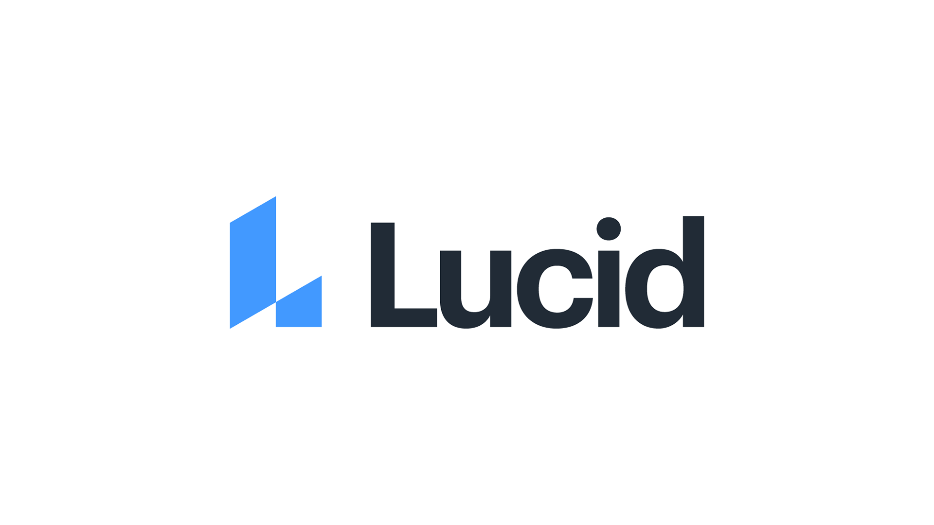
The new logo is easier to produce, more memorable, and scales more effectively. Dropping "software" from the logo makes it more compact and encourages people to use the simpler name. The new logotype conveys a sense of technical precision that is more aligned with the company culture.
It also contains a concept that is meaningful to the company: progress.
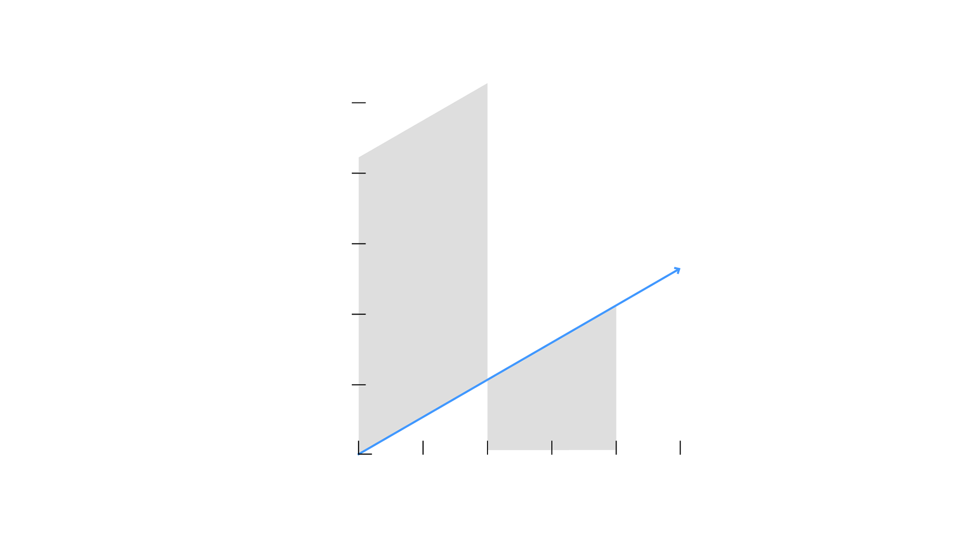
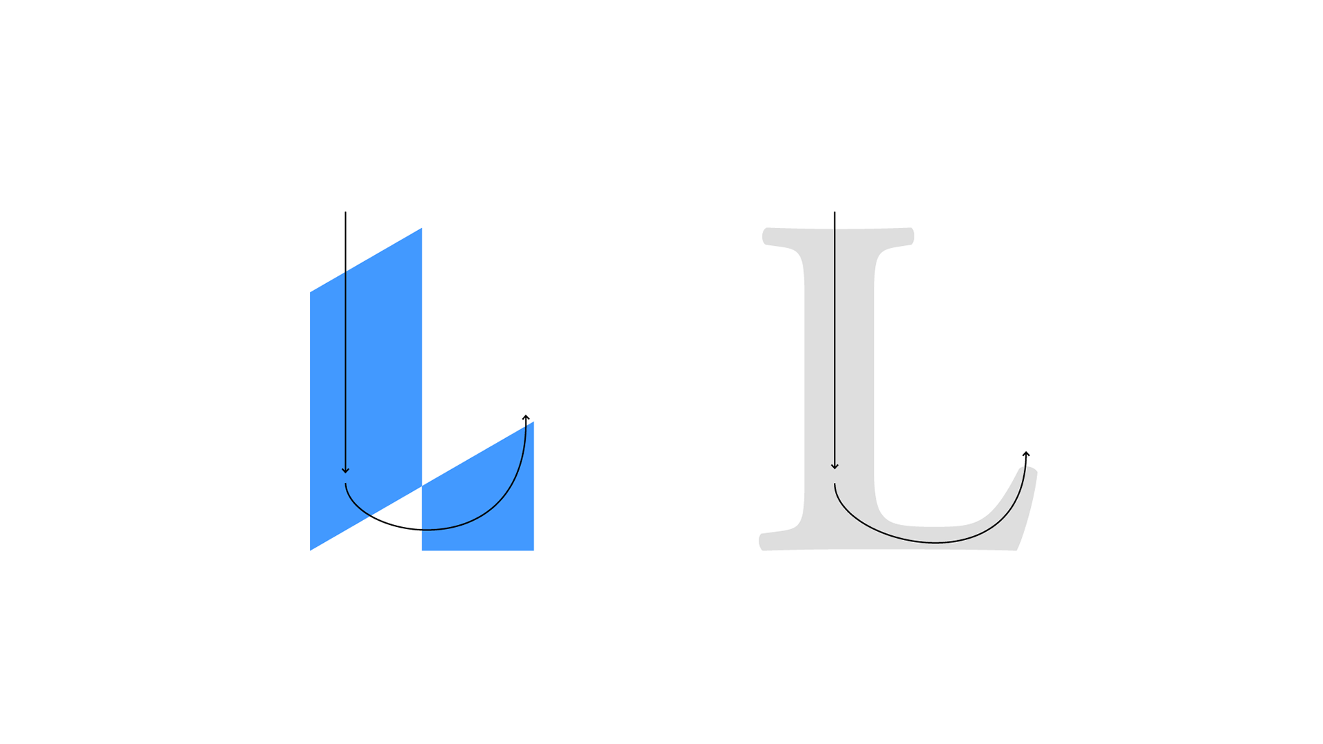
It conforms to the classical "L" letterform, making it more legible.
The company is now clearly distinguished from its products.
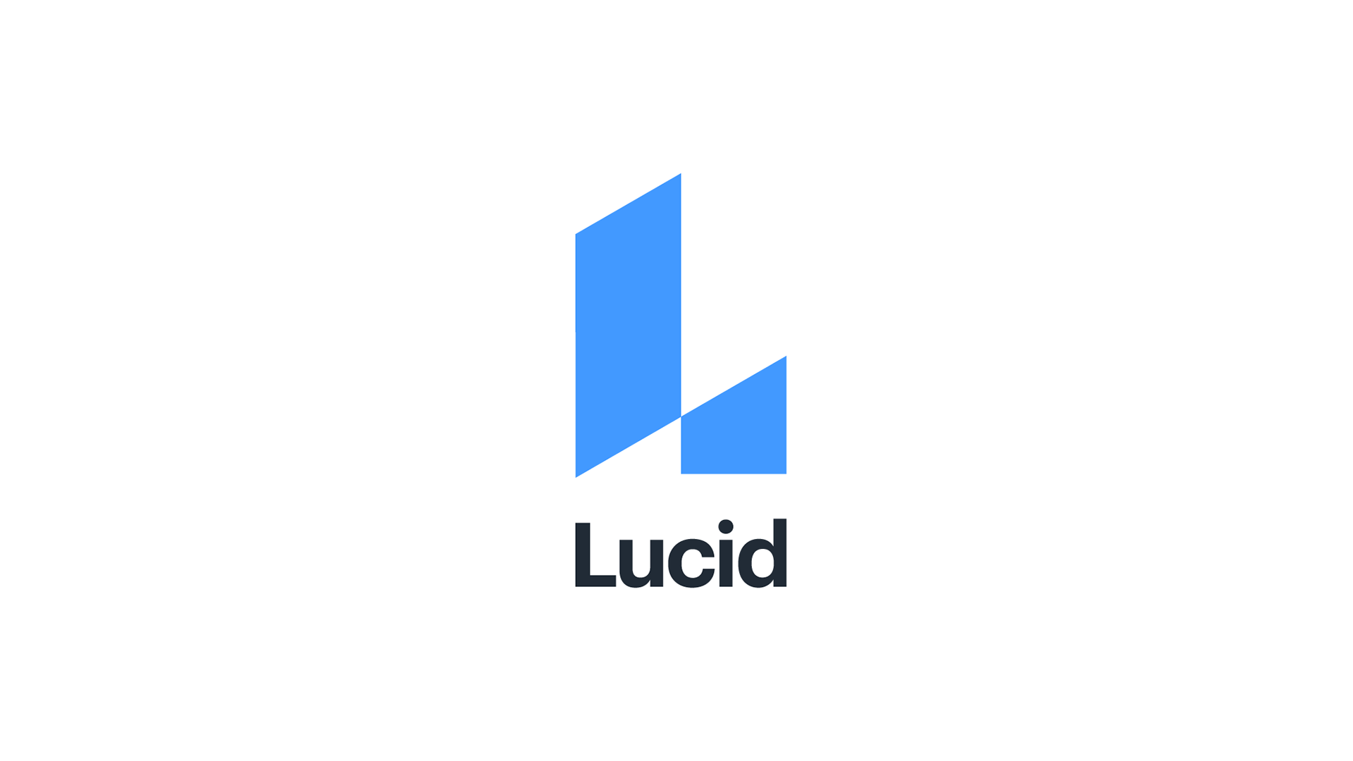
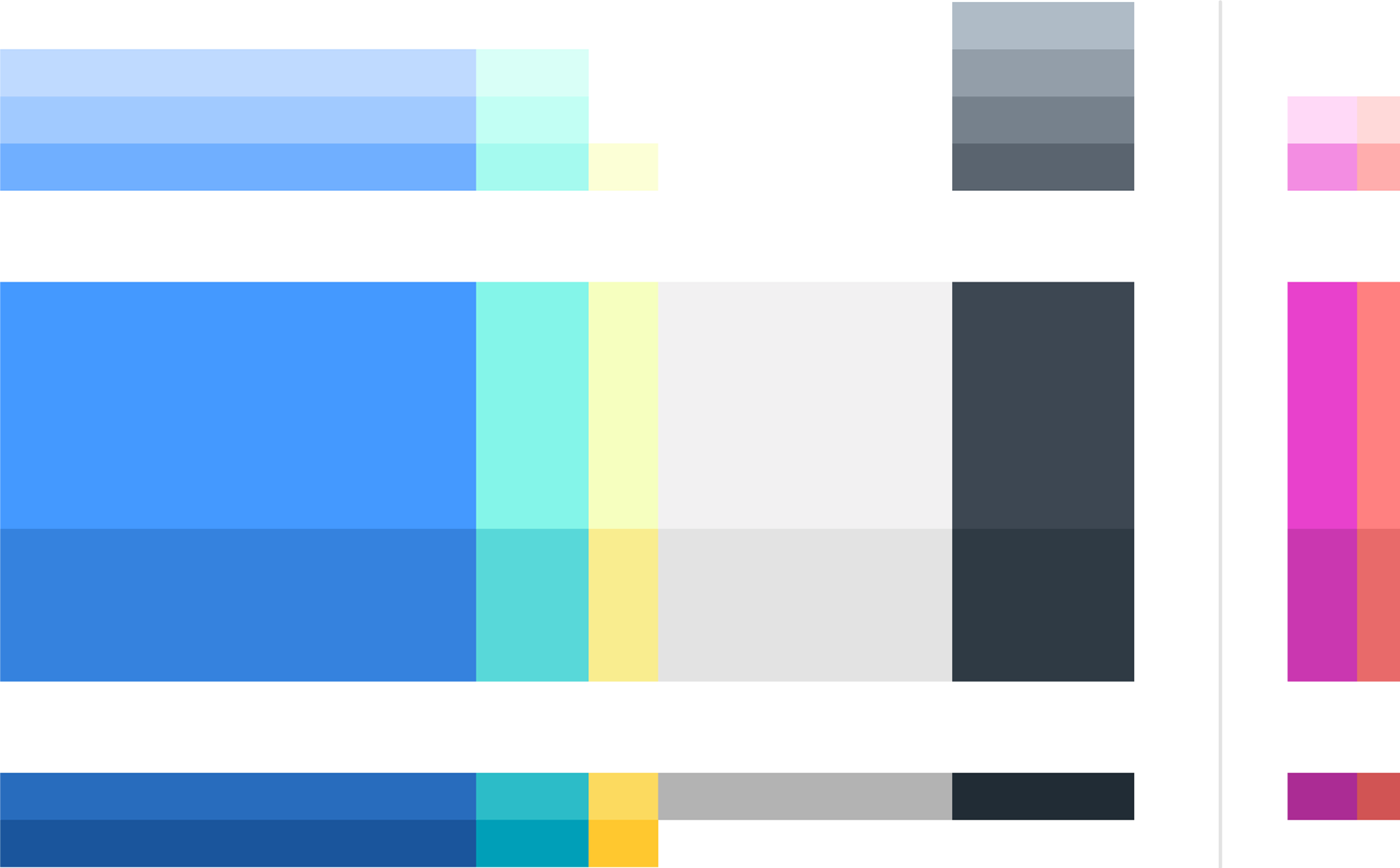
We updated the brand color to make it more vibrant.

A completely new brand color palette was developed based on the concept of refracted light. The idea was derived from the sense of the word "lucid" that means "luminous."
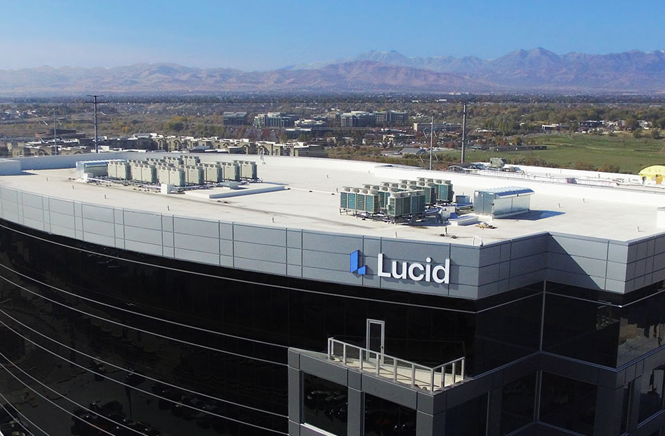
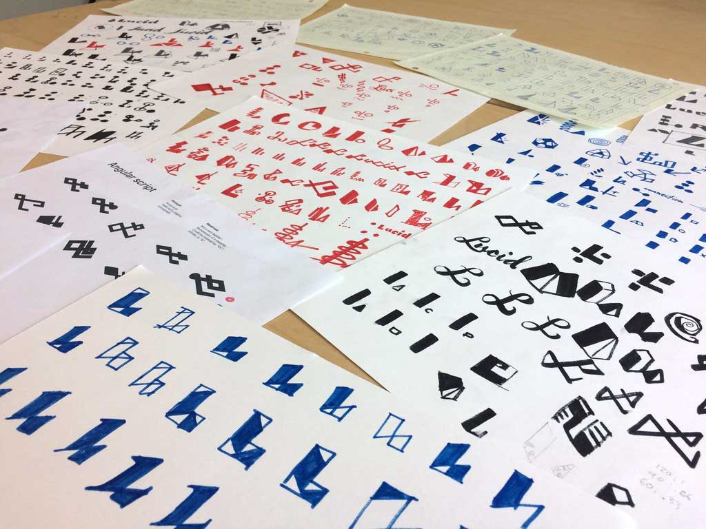
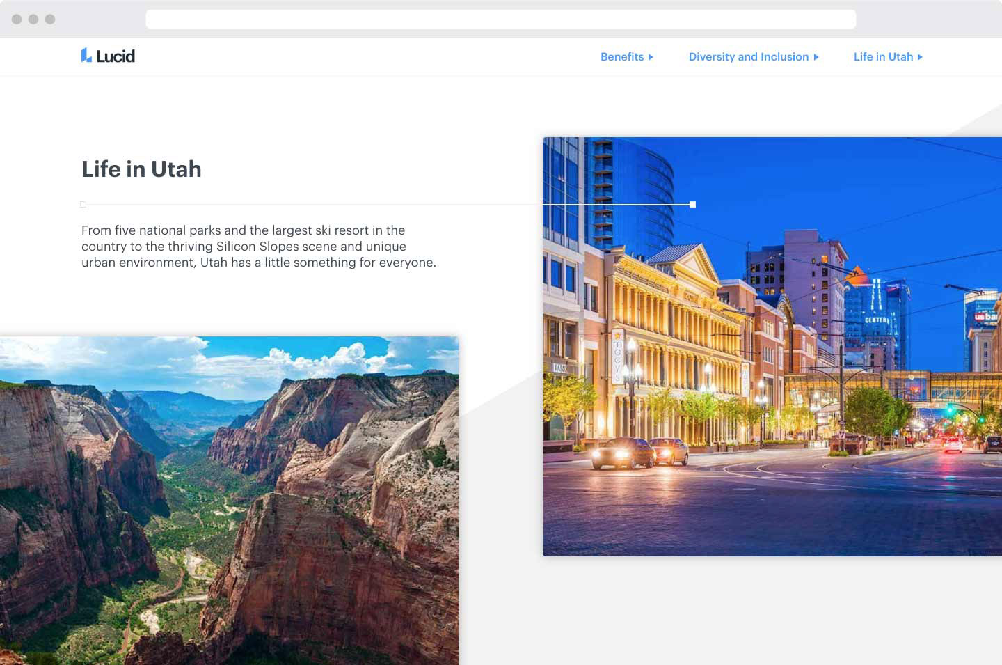
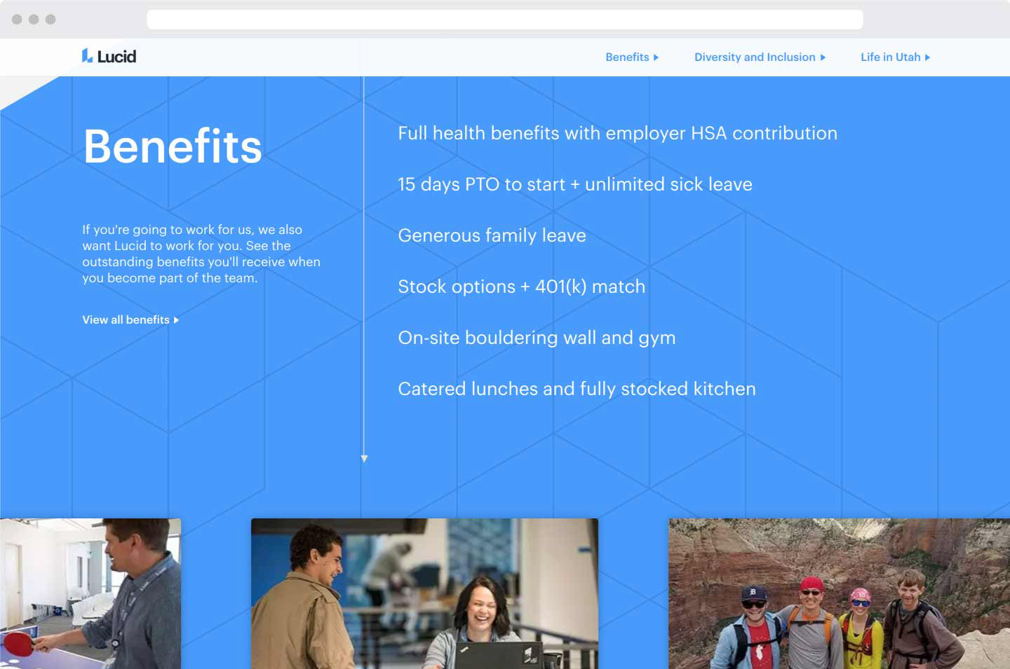
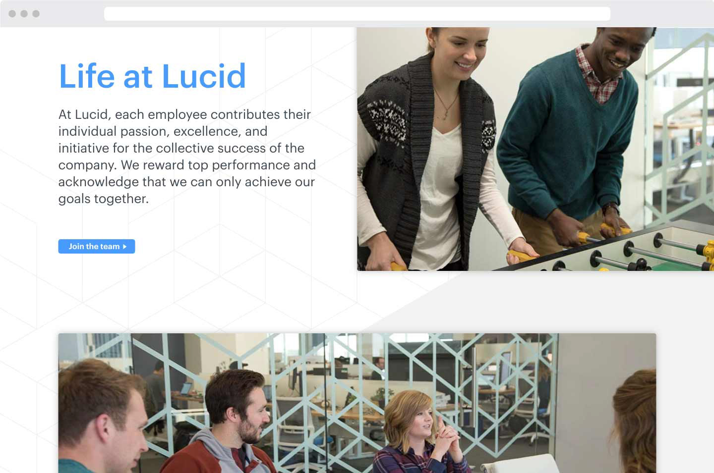
Shortly following the rebrand came the redesign of the website. I was the designer and also directed the photography.
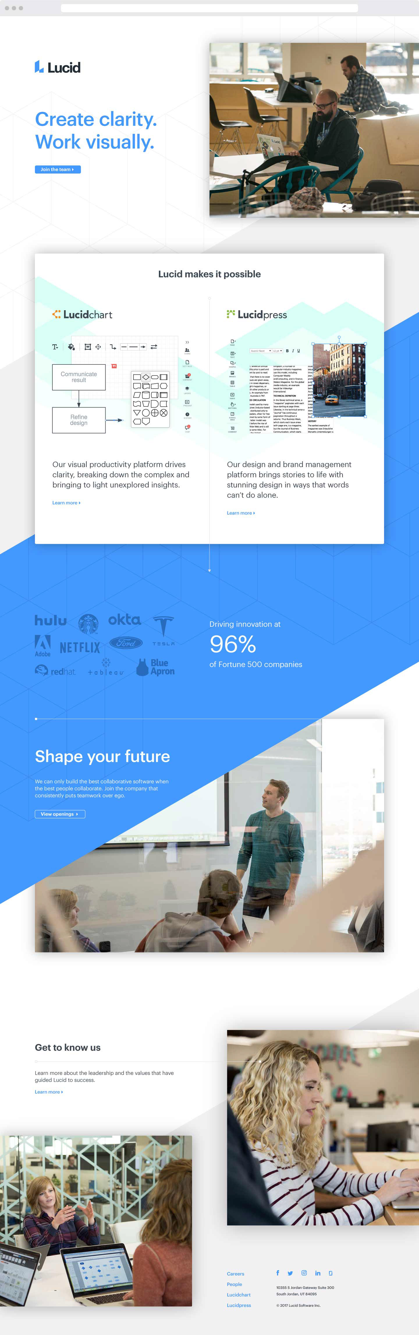
View the live site here.